本文译自Hints in Compose ,原文由Viktor Mykhailiv 发布于2025年2月13日,文章内容巨详细,TL;DR;。
有时我们的应用需要突出显示某些 UI 组件,例如在首次登录(首次使用)时,或者当我们添加新内容(“新功能”)时。
在本文中,我将指导如何构建自定义解决方案来显示提示/工具提示,指向 Compose(Compose Multiplatform 和 Jetpack Compose)中的特定 UI 元素。
布局层次
要突出显示 UI 元素,首先我们应该了解“提示”(Hints)的主要概念。
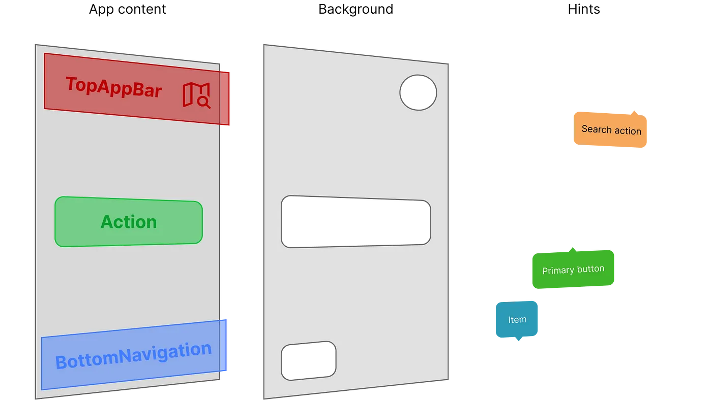
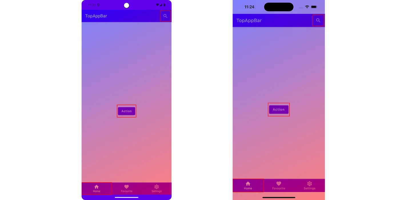
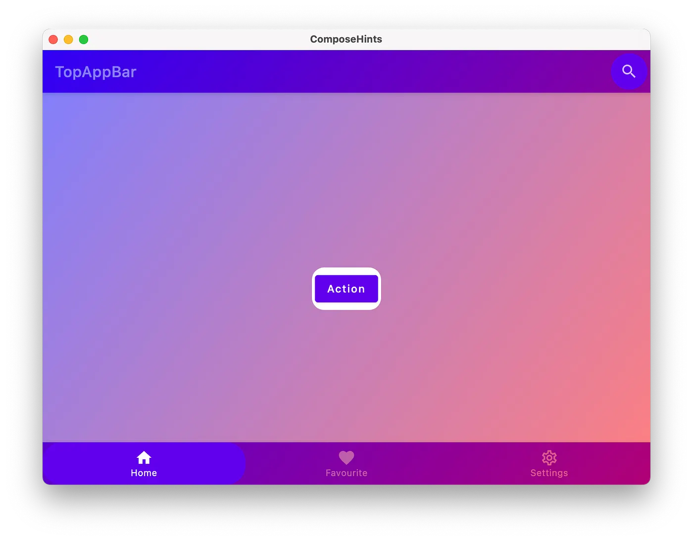
假设我们有一个带有 TopBar、BottomNavigation 和主要操作按钮的应用程序。我们想要突出显示 TopBar 的操作、主要按钮和 BottomNavigation 中的一个项目。
对于我们的“提示”,我们需要绘制一个暗淡的背景(也是为了拦截触摸事件),计算突出显示的 UI 元素的位置,剪掉(屏蔽)我们的元素形状以免变暗,最后绘制一个提示(例如带有背景的文本)。
1. 暗淡的背景
要在所有内容之上绘制一个暗淡的背景作为覆盖或弹出窗口,我们可以:
a. 使用自定义可组合项包装我们应用(根组件)的所有内容(例如带有 Modifier.background 的 Box)
1
2
3
4
5
6
7
8
9
10
@Composable
fun AppContent () {
HintOverlay {
MaterialTheme {
Scaffold {
// 我的应用内容
}
}
}
}
b. 使用对话框
通过使用对话框,我们可以在所有内容之上显示一个覆盖层(例如,在 Android 上,对话框显示在自己的窗口中)。
使用对话框时,Compose Multiplatform 中的 scrimColor 会出现问题。我们无法从 Compose 通用目标配置 scrimColor ,但每个目标(Android 除外)都为 scrimColor 提供了一个实际值。作为一种可能的解决方案,我们可以创建一个例外类来提供对话框属性并为每个目标提供实际实现。
c. 使用 Popup
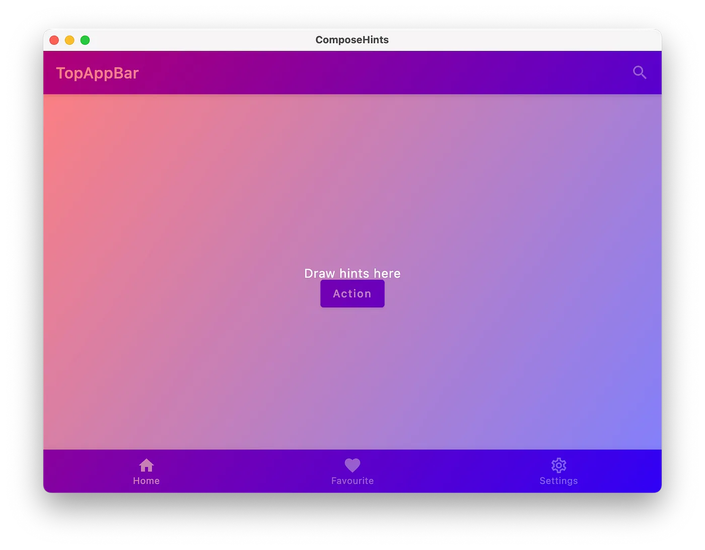
Popup 在这里看起来更好,因为它默认不绘制 scrimColor,并且覆盖层显示在所有内容之上。
我会采用第三种方法,不强制手动使用 HintOverlay。
我还想为覆盖层背景添加 Brush 支持,而不仅仅是 Color 。
1
2
3
4
5
6
7
8
9
10
11
12
13
14
15
16
17
18
19
20
21
22
23
24
25
26
27
28
val LocalHintOverlayColor = staticCompositionLocalOf < Color > { Color ( 0 x44000000 ) }
val LocalHintOverlayBrush = staticCompositionLocalOf < Brush ?> { null }
@Composable
fun HintOverlay () {
Popup {
Box (
modifier = Modifier
. fillMaxSize ()
. overlayBackground ()
) {
Text (
modifier = Modifier . align ( Alignment . Center ),
text = "Draw hints here" ,
color = Color . White ,
)
}
}
}
/**
* 从 [LocalHintOverlayBrush] 或 [LocalHintOverlayColor] 设置 `background`。
*/
private fun Modifier . overlayBackground (): Modifier = composed {
LocalHintOverlayBrush . current ?. let { background ( it ) }
?: background ( LocalHintOverlayColor . current )
}
我可以使用CompositionLocalProvider 设置 Brush 来覆盖覆盖的背景。
1
2
3
4
5
6
7
8
9
10
CompositionLocalProvider (
LocalHintOverlayBrush provides Brush . linearGradient (
listOf (
Color . Red . copy ( alpha = 0.5f ),
Color . Blue . copy ( alpha = 0.5f ),
)
),
) {
HintOverlay ()
}
2. 计算锚点坐标
要获取 Compose 中 UI 元素的坐标,我们可以使用OnGloballyPositionedModifier ,当内容的全局位置可能发生变化时,会使用布局的最终 LayoutCoordinates 调用该方法。
使用示例:
1
2
3
4
5
6
7
8
9
10
11
12
13
14
15
16
17
Column (
Modifier . onGloballyPositioned { coordinates ->
// 这将是Column的大小。
coordinates . size
// Column相对于应用程序窗口的位置。
coordinates . positionInWindow ()
// Column相对于 Compose 根的位置。
coordinates . positionInRoot ()
// 这些将是提供给布局的对齐线(此处的Column为空)。
coordinates . providedAlignmentLines
// 这将是与 Column 的父级相对应的 LayoutCoordinates 实例。
coordinates . parentLayoutCoordinates
}
) {
Box ( Modifier . size ( 20. dp ). background ( Color . Green ))
Box ( Modifier . size ( 20. dp ). background ( Color . Blue ))
}
对于我们的提示,我们需要创建一个状态来保存锚点的坐标和大小,并引入一个修改器来更新状态:
1
2
3
4
5
6
7
8
9
10
11
12
13
14
15
16
17
18
19
@Stable
class HintAnchorState internal constructor () {
internal var size : IntSize by mutableStateOf ( IntSize . Zero )
internal var offset : Offset by mutableStateOf ( Offset . Zero )
}
@Composable
fun rememberHintAnchorState (): HintAnchorState {
return remember { HintAnchorState () }
}
fun Modifier . hintAnchor ( state : HintAnchorState ): Modifier {
return onGloballyPositioned {
state . size = it . size
state . offset = it . positionInWindow ()
}
}
因此,我们只需订阅所需 UI 元素的大小和坐标变化即可更新锚点的状态。
现在我们需要将此 hintAnchor 修饰符应用于我们的内容:
1
2
3
4
5
6
7
8
9
10
11
12
13
14
15
16
17
18
19
20
21
22
23
24
val topAppBarActionHintAnchor = rememberHintAnchorState ()
val actionHintAnchor = rememberHintAnchorState ()
val bottomNavigationHintAnchor = rememberHintAnchorState ()
IconButton (
modifier = Modifier
. hintAnchor ( topAppBarActionHintAnchor ),
onClick = {},
)
Button (
modifier = Modifier
. hintAnchor ( actionHintAnchor )
. padding ( 4. dp ),
onClick = {},
) {
Text ( "Action" )
}
BottomNavigationItem (
modifier = Modifier
. hintAnchor ( topAppBarActionHintAnchor ),
//... 传入其他需要的参数
)
注意: 修饰符顺序在 Compose 中始终很重要,我们在 hintAnchor 后设置 4.dp,以便在此按钮周围留出额外空间(锚点的尺寸将比实际按钮的尺寸大 4.dp)。
HintOverlay 可组合项需要进行一些更改才能使用 HintAnchorState为此锚点绘制提示。
1
2
3
4
5
6
7
8
9
10
11
12
13
14
15
16
17
18
19
20
21
22
23
24
25
26
27
28
29
30
31
32
33
34
35
36
37
38
39
40
41
@Composable
fun HintOverlay (
anchors : () -> List < HintAnchorState >,
) {
Box (
modifier = Modifier
. fillMaxSize ()
. overlayBackground ( anchors )
)
}
/**
* 从 [LocalHintOverlayBrush] 或 [LocalHintOverlayColor] 设置“background”。
*/
private fun Modifier . overlayBackground (
anchors : () -> List < HintAnchorState >,
): Modifier = composed {
val backgroundBrush = LocalHintOverlayBrush . current
val backgroundColor = LocalHintOverlayColor . current
drawWithCache {
onDrawWithContent {
if ( backgroundBrush != null ) {
drawRect ( backgroundBrush )
} else {
drawRect ( backgroundColor )
}
anchors (). forEach { anchor ->
drawRect (
color = Color . Red ,
topLeft = anchor . offset ,
size = anchor . size . toSize (),
style = Stroke ( width = 5f ),
)
}
drawContent ()
}
}
}
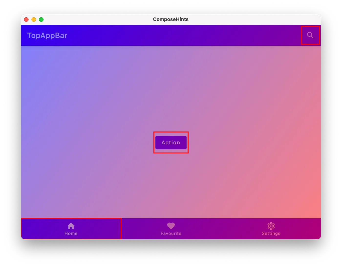
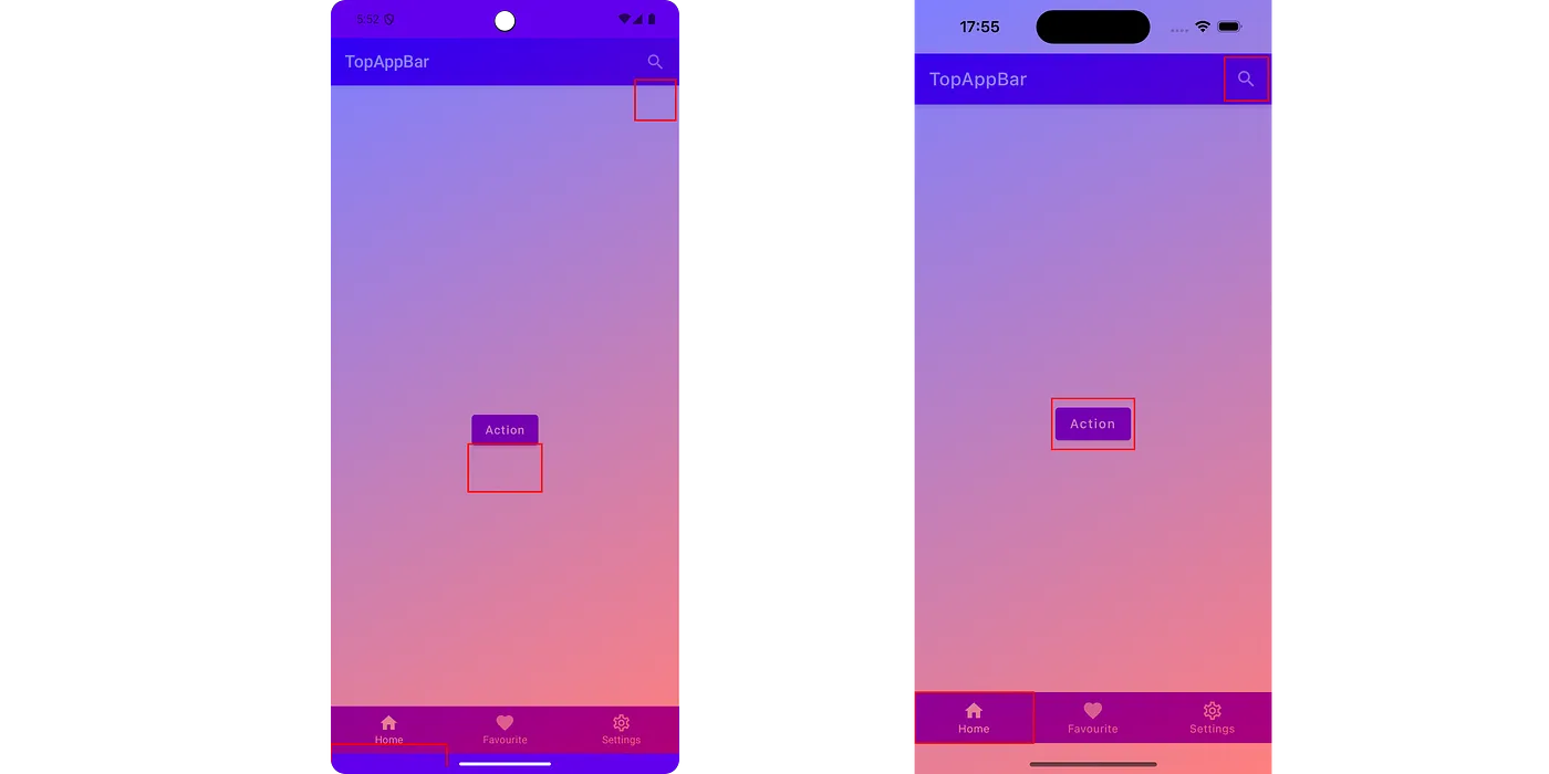
现在我们只需在锚点周围画一个红色矩形:
但如果我们在移动设备上运行,我们会在 Android 上得到错误的数字:
该问题与 WindowInsets 有关。让我们减去这些 insets 来修复它:
1
2
3
4
5
6
7
8
9
10
fun Modifier . hintAnchor ( state : HintAnchorState ): Modifier = composed {
val statusBarInsets = WindowInsets . statusBars . getTop ( LocalDensity . current ). toFloat ()
onGloballyPositioned {
state . size = it . size
state . offset = it . positionInWindow ()
// 修复 Android 上的 WindowInsets
. minus ( Offset ( x = 0f , y = statusBarInsets ))
}
}
3. 剪辑出锚点的形状
要剪辑形状,我们将使用 Path 和 PathOperation 。修改 hintAnchor Modifier 以接受 Shape ,它将用于在锚点周围设置所需的形状。
1
2
3
4
5
6
7
8
9
10
11
12
13
14
15
fun Modifier . hintAnchor (
state : HintAnchorState ,
shape : Shape = RectangleShape ,
): Modifier {
state . shape = shape
//..onGloballyPositioned
}
@Stable
class HintAnchorState internal constructor () {
//...其他的状态放这里
internal var shape : Shape by mutableStateOf ( RectangleShape )
}
根据提供的形状,我们可以创建一个轮廓,用于将锚点的形状从背景中剪掉:
1
2
3
4
5
6
7
8
9
10
11
12
13
14
15
16
17
18
19
20
21
22
23
24
25
26
27
28
29
30
31
32
33
34
35
36
37
38
39
40
41
42
43
44
45
46
47
internal fun Modifier . overlayBackground (
anchors : () -> List < HintAnchorState >,
): Modifier = composed {
val backgroundBrush = LocalHintOverlayBrush . current
val backgroundColor = LocalHintOverlayColor . current
val layoutDirection = LocalLayoutDirection . current
val density = LocalDensity . current
drawWithCache {
// 准备背景路径
val path = Path (). apply {
lineTo ( size . width , 0f )
lineTo ( size . width , size . height )
lineTo ( 0f , size . height )
lineTo ( 0f , 0f )
close ()
}
anchors (). forEach { anchor ->
// 为锚点准备路径
val anchorPath = Path ()
anchorPath . addOutline (
anchor . shape . createOutline (
size = anchor . size . toSize (),
layoutDirection = layoutDirection ,
density = density ,
)
)
anchorPath . translate ( anchor . offset )
anchorPath . close ()
// 裁剪掉锚点
path . op ( path , anchorPath , PathOperation . Xor )
}
onDrawWithContent {
// 我们不仅仅绘制路径,而不是像以前一样绘制矩形
if ( backgroundBrush != null ) {
drawPath ( path , backgroundBrush )
} else {
drawPath ( path , backgroundColor )
}
drawContent ()
}
}
}
让我们传递 CircleShape 和 RoundedCornerShape 来看看提示现在是什么样子:
此时,我们知道如何绘制背景覆盖层、计算锚点的位置以及如何剪裁背景。
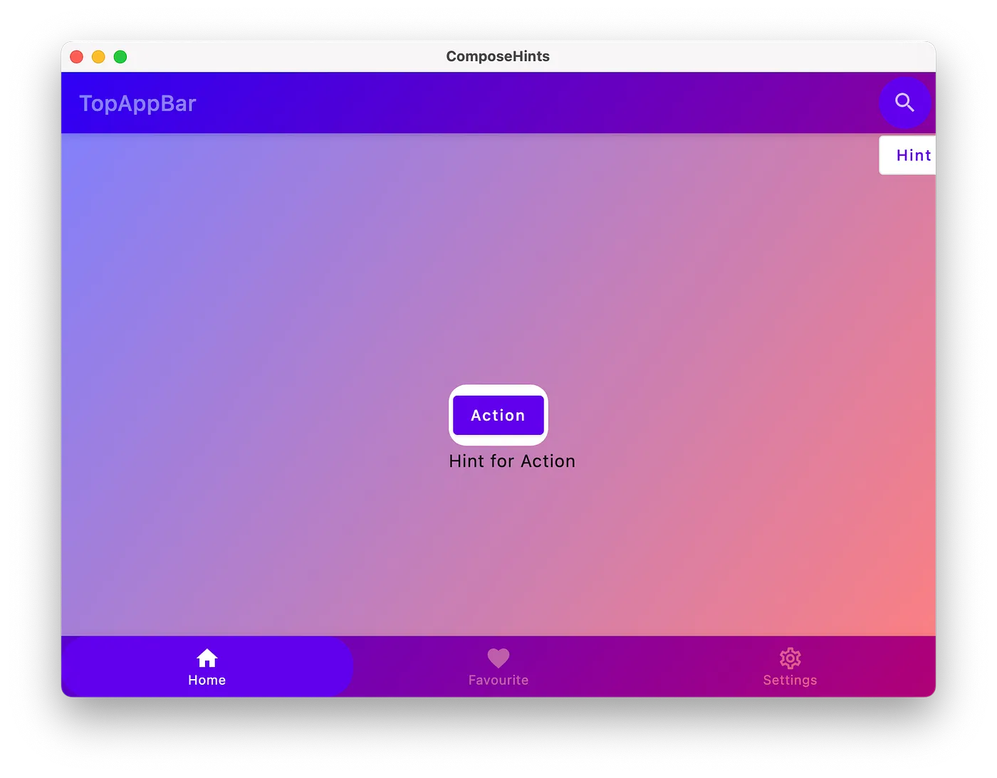
4. 绘制提示
在实际绘制之前,我们应该定义提示需要呈现哪些信息。
为了不强制只提供文本,我们采用slot方法。通过定义slot,我们允许使用任何所需的composables。
我将介绍一个新的类 Hint 来保存我们的Composable内容:
1
2
3
4
5
6
7
8
9
10
11
12
@Stable
class Hint internal constructor () {
internal var content : @Composable () -> Unit by mutableStateOf ({})
}
@Composable
fun rememberHint ( content : @Composable () -> Unit ): Hint {
return remember {
Hint (). also { it . content = content }
}
}
并将此 Hint 添加为 HintAnchorState 的一部分:
1
2
3
4
5
6
7
8
9
10
11
12
13
@Stable
class HintAnchorState internal constructor (
internal val hint : Hint ,
) {
//...其他的状态放这里
}
@Composable
fun rememberHintAnchorState ( hint : Hint ): HintAnchorState {
return remember ( hint ) {
HintAnchorState ( hint )
}
}
在 HintOverlay 内部,我们可以采用最简单的解决方案 — BoxWithConstraints :
1
2
3
4
5
6
7
8
9
10
11
12
13
14
15
16
17
18
19
20
21
22
23
@Composable
fun HintOverlay (
anchors : () -> List < HintAnchorState >,
) {
//...
BoxWithConstraints (
modifier = Modifier
. fillMaxSize ()
. overlayBackground ( anchors )
) {
anchors (). forEach { anchor ->
Box (
modifier = Modifier
. graphicsLayer {
translationX = anchor . offset . x
translationY = anchor . offset . y + anchor . size . height
},
) {
anchor . hint . content ()
}
}
}
}
修改应用程序内容:
1
2
3
4
5
6
7
8
9
10
11
12
13
14
15
16
17
18
19
20
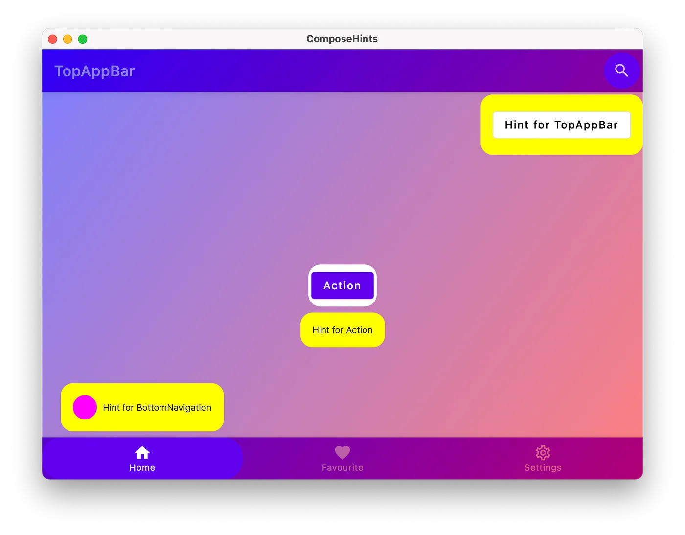
val topAppBarHint = rememberHint {
OutlinedButton ( onClick = {}) { Text ( "Hint for TopAppBar" ) }
}
val topAppBarActionHintAnchor = rememberHintAnchorState ( topAppBarHint )
val actionHint = rememberHint {
Text ( "Hint for Action" )
}
val actionHintAnchor = rememberHintAnchorState ( actionHint )
val bottomNavigationHint = rememberHint {
Row (
verticalAlignment = Alignment . CenterVertically ,
) {
Spacer ( Modifier . size ( 32. dp ). background ( Color . Magenta , CircleShape ))
Spacer ( Modifier . size ( 8. dp ))
Text ( "Hint for BottomNavigation" )
}
}
val bottomNavigationHintAnchor = rememberHintAnchorState ( bottomNavigationHint )
结果如下:
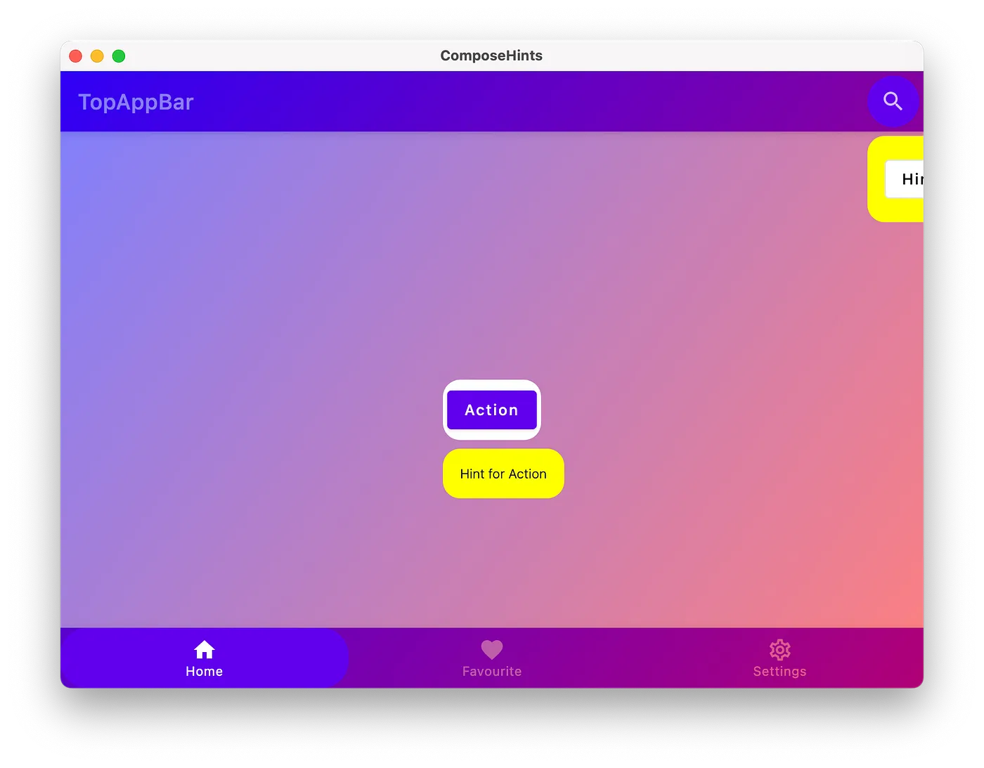
让我们引入一个应用程序特定的代码来绘制提示背景。
1
2
3
4
5
6
7
8
9
10
11
12
13
14
15
16
17
18
19
20
21
@Composable
fun rememberHintContainer ( content : @Composable () -> Unit ): Hint {
return rememberHint {
Box (
modifier = Modifier
. padding ( top = 8. dp )
. background ( Color . Yellow , shape = RoundedCornerShape ( 16. dp ))
. padding ( 16. dp ),
) {
CompositionLocalProvider (
LocalTextStyle provides TextStyle (
color = Color . Black ,
fontSize = 12. sp ,
fontWeight = FontWeight . Light ,
),
) {
content ()
}
}
}
}
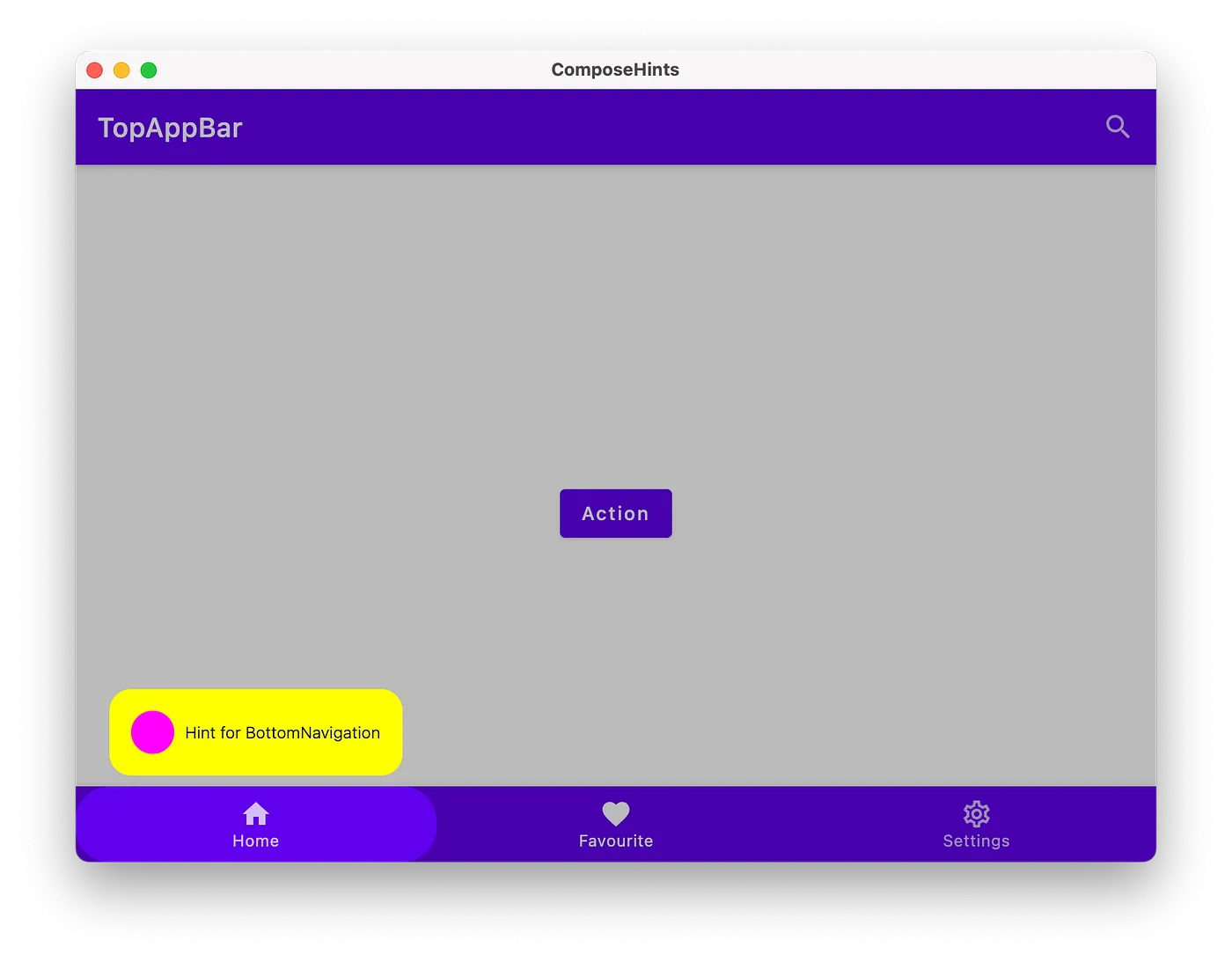
我们遇到了 2 个问题:
水平对齐,提示应与其锚点居中对齐。
BottomNavigation 的提示超出了屏幕范围。
让我们改用自定义布局并修复这些问题。
要测量和布局多个可组合项,请使用 Layout。此composable允许我们手动测量和布局子项。所有更高级别的布局(如 Column 和 Row)都是使用 Layout 实现的。
1
2
3
4
5
6
7
8
9
10
11
12
13
14
15
16
17
18
19
20
21
22
23
24
25
26
27
28
29
30
31
32
33
34
35
36
37
38
39
40
41
42
43
44
45
46
47
@Composable
internal fun HintsContainer (
modifier : Modifier ,
anchors : () -> List < HintAnchorState >,
) {
val anchors = anchors ()
Layout (
modifier = modifier
. overlayBackground ( anchors ),
content = {
anchors . forEach { it . hint . content () }
},
) { measurables , constraints ->
// 测量每一个提示
val placeables = measurables . map { measurable ->
measurable . measure (
constraints . copy ( minWidth = 0 , minHeight = 0 )
)
}
// 将布局尺寸设置得尽可能大
layout ( constraints . maxWidth , constraints . maxHeight ) {
// 将每个提示相对于其锚点放置
placeables . forEachIndexed { index , placeable ->
val anchor = anchors [ index ]
// 将此提示居中对齐
val x = ( anchor . offset . x . toInt () - ( placeable . width - anchor . size . width ) / 2 )
// 修复超出屏幕的坐标
. coerceAtLeast ( 0 )
. coerceAtMost ( constraints . maxWidth - placeable . width )
// 把这个提示放在它的锚点下面
var y = ( anchor . offset . y . toInt () + anchor . size . height )
// 如果超出屏幕,则修复 y 坐标
. coerceAtMost ( constraints . maxHeight - placeable . height )
if ( y < anchor . offset . y + anchor . size . height ) {
// 提示与锚点重叠,请将此提示放在其锚点上方
y = anchor . offset . y . toInt () - placeable . height
}
placeable . placeRelative ( x = x , y = y )
}
}
}
}
因为我们允许传递任何可组合项作为提示,所以调用者可以完全控制提示的外观,例如,我们可以只使用 Text ,或者使用包含许多子项的复杂 Row 。
5. 如何控制提示?
我们静态地添加了提示以将其显示在屏幕上。但真正产品应用程序并非如此。让我们引入 HintController 来控制何时显示提示。
1
2
3
4
5
6
7
8
9
10
11
12
13
14
15
16
17
18
19
20
@Stable
class HintController internal constructor () {
internal var hint by mutableStateOf < HintAnchorState ?>( null )
fun show ( hint : HintAnchorState ) {
this . hint = hint
}
}
@Composable
fun rememberHintController (): HintController {
val controller = remember { HintController () }
controller . hint ?. let { hint ->
HintOverlay ( anchor = hint )
}
return controller
}
修改应用程序内容,以便在我们点击锚点时显示提示:
1
2
3
4
5
6
7
8
9
10
11
12
13
14
15
16
17
18
19
20
21
22
23
24
25
26
27
28
29
val hintController = rememberHintController ()
IconButton (
modifier = Modifier
. hintAnchor ( topAppBarActionHintAnchor , CircleShape ),
onClick = {
hintController . show ( topAppBarActionHintAnchor )
},
)
BottomNavigationItem (
modifier = Modifier
. hintAnchor (
bottomNavigationHintAnchor ,
shape = RoundedCornerShape ( 50f ),
),
onClick = {
hintController . show ( bottomNavigationHintAnchor )
},
)
Button (
modifier = Modifier
. hintAnchor ( actionHintAnchor , RoundedCornerShape ( 16. dp ))
. padding ( 4. dp ),
onClick = {
hintController . show ( actionHintAnchor )
},
)
注意:我们不再需要显示的 HintOverlay ,它现在变得内置了。
现在我们可以逐一显示提示,但还有两个部分缺失:如何关闭提示,以及如何覆盖覆盖颜色。
对提示控制器进行更改以允许传递覆盖颜色:
1
2
3
4
5
6
7
8
9
10
11
12
13
14
15
16
17
18
19
20
21
22
@Composable
fun rememberHintController ( overlay : Brush ): HintController {
return rememberHintController ( overlay = LocalHintOverlayBrush provides overlay )
}
@Composable
fun rememberHintController ( overlay : Color = HintOverlayColorDefault ): HintController {
return rememberHintController ( overlay = LocalHintOverlayColor provides overlay )
}
@Composable
private fun rememberHintController ( overlay : ProvidedValue <*>): HintController {
val controller = remember { HintController () }
controller . hint ?. let { hint ->
CompositionLocalProvider ( overlay ) {
HintOverlay ( anchor = hint )
}
}
return controller
}
为了消除我们的提示,让我们引入以下变化:
1
2
3
4
5
6
7
8
9
10
11
12
13
@Stable
class HintController internal constructor () {
internal var hint by mutableStateOf < HintAnchorState ?>( null )
fun show ( hint : HintAnchorState ) {
this . hint = hint
}
fun dismiss () {
hint = null
}
}
我们使用 Popup 作为覆盖层的容器,如果用户点击 Android 上的返回按钮(BACK),Popup 就会被关闭。
1
2
3
4
5
6
7
8
9
10
11
12
13
14
15
16
17
18
19
20
21
22
23
24
25
26
27
28
29
30
31
@Composable
internal fun HintOverlay (
anchor : HintAnchorState ,
onDismiss : () -> Unit ,
) {
Popup (
onDismissRequest = onDismiss ,
// 设置可聚焦以处理按压back事件
properties = remember { PopupProperties ( focusable = true ) },
) {
//...在这里画出我们的提示
}
}
@Composable
internal fun HintsContainer (
modifier : Modifier ,
anchor : HintAnchorState ,
onDismiss : () -> Unit ,
) {
Layout (
modifier = modifier
. overlayBackground ( anchor )
. clickable (
interactionSource = null ,
// 禁用ripple
indication = null ,
onClick = onDismiss ,
)
)
}
结果演示视频 https://youtu.be/eo49PKlhO5Y
现在,HintController 允许我们按时间显示一个提示,但如果我们想按顺序显示多个提示,则没有实际的队列。
可以扩展 HintController 并添加暂停修饰符以知道提示的显示时间(例如,在显示提示后立即执行某项操作)。
1
2
3
4
5
6
7
8
9
10
11
12
13
14
15
16
17
18
19
20
21
22
23
24
25
26
27
28
29
30
31
32
33
34
35
36
37
38
39
40
41
42
43
44
@Stable
class HintController internal constructor () {
private var queue = mutableStateListOf < HintAnchorState >()
internal val hint : HintAnchorState ? get () = queue . firstOrNull ()
private val pendingRequests = mutableMapOf < HintAnchorState , Continuation < Unit >>()
suspend fun show ( hint : HintAnchorState ) {
suspendCoroutine { continuation ->
pendingRequests [ hint ] = continuation
queue . add ( hint )
}
}
suspend fun show ( vararg hint : HintAnchorState ) {
show ( hint . toList ())
}
suspend fun show ( hints : List < HintAnchorState >) {
suspendCoroutine { continuation ->
pendingRequests [ hints . last ()] = continuation
queue . addAll ( hints )
}
}
internal fun onDismissed ( hint : HintAnchorState ) {
pendingRequests [ hint ] ?. let { continuation ->
continuation . resume ( Unit )
pendingRequests . remove ( hint )
}
queue . remove ( hint )
}
fun dismiss () {
pendingRequests . values
. forEach { continuation ->
continuation . resumeWithException ( CancellationException ( "Hint was dismissed" ))
}
pendingRequests . clear ()
queue . clear ()
}
}
现在为了在应用程序内部显示提示,我们需要一个 CoroutineScope :
1
2
3
4
5
6
7
8
9
10
11
12
13
14
15
16
17
18
19
20
21
22
23
24
25
26
27
28
29
30
31
32
33
34
35
val coroutineScope = rememberCoroutineScope ()
val hintController = rememberHintController ()
// 现在我们可以从提示本身中忽略所有待处理的提示
val topAppBarHint = rememberHintContainer {
OutlinedButton (
onClick = {
hintController . dismiss ()
}
) { Text ( "Hint for TopAppBar" ) }
}
// 显示 1 条提示
BottomNavigationItem (
onClick = {
coroutineScope . launch {
hintController . show ( bottomNavigationHintAnchor )
scaffoldState . snackbarHostState . showSnackbar ( "One hint was shown" )
}
},
)
// 连续显示多个提示
Button (
onClick = {
coroutineScope . launch {
hintController . show (
topAppBarActionHintAnchor ,
actionHintAnchor ,
bottomNavigationHintAnchor ,
)
scaffoldState . snackbarHostState . showSnackbar ( "Many hints were shown" )
}
},
)
注意: 如果我们通过调用 hintController.dismiss() 来关闭提示,则 hintController.show 之后的代码将不会被调用。
1
2
3
4
5
coroutineScope . launch {
hintController . show ( topAppBarActionHintAnchor )
// 如果通过调用 hintController.dismiss 关闭了之前的提示,则不会显示 Snackbar
scaffoldState . snackbarHostState . showSnackbar ( "One hint was shown" )
}
最终结果如这个视频演示 https://youtu.be/tyZUNJLEVxQ :我们可以显示单个提示,也可以显示提示列表。
由于该项目使用 Compose Multiplatform,我们可以针对不同的目标运行该应用程序:
总结
Compose 和 Kotlin Multiplatform 是一个强大的组合,它允许我们使用 Kotlin 来实现 UI 和业务逻辑。CMP 库仅与Jetpack Compose Android 项目完全兼容。
可以在 GitHub 上查看我的repo:https://github.com/vitoksmile/ComposeHints 。
感谢你的阅读,期待在 GitHub 上获得你的Star :)。